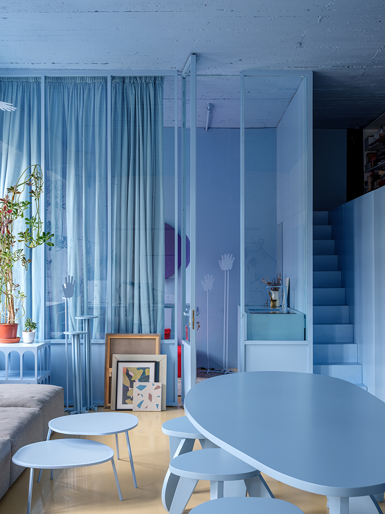
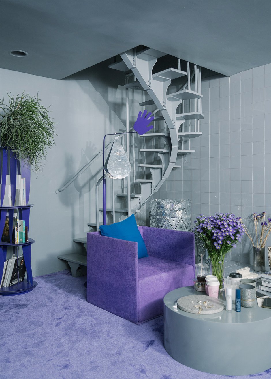
You ever see that crazy stuff from Harry Nuriev? Yeah, that guy. His designs, especially those super bright, almost cartoonish pieces, they sort of stick in your head, you know? For me, it was this one chair I saw online, looked like it was made of chunky, digital blocks but was totally real. Wild. And everything’s always one intense color. Really makes you look twice.

Anyway, I had this really boring, forgotten little side table in my living room. Just kind of there, collecting dust and annoying me. And my brain, probably needing a distraction, went ‘Hey, why not try to give that table a bit of that Nuriev vibe?’ Seemed like a straightforward enough project. Something to do with my hands. Famous last words, of course. I thought, get some paint, make it bold. Simple.
My Brilliant Idea Meets Reality
So, the plan was hatched. I wasn’t aiming to build a whole pixelated sofa or anything, I’m not a magician. I just wanted to capture that solid, super-saturated color block look on this sad little table. How hard could it be, right? Turns out, pretty darn hard.
First challenge: the color. That distinctive, almost unreal vibrant color he uses. You see it in pictures and it looks so pure and flat. I went to the store, grabbed a bunch of paint chips. Nothing felt quite right. Then I bought a few small cans. One was too glossy, another too dull. Finding that perfect, almost digital-looking shade that didn’t just look like I’d attacked my furniture with a cheap spray can took way longer than I thought. The guy at the paint counter started to look wary when he saw me coming.
Then, the actual painting. His pieces look so seamless, so monolithic. My first attempt to get that perfectly smooth, even coat? It was a disaster. Streaks everywhere. Then some weird bubbling in one spot. It looked less like high design and more like a kindergarten art project gone a bit wrong. Patience, I learned, is key. Lots of it. Sanding, priming, painting, waiting, sanding again… ugh.
And the whole “minimalist” thing. Sounds easy, doesn’t it? Just keep it simple. But when something is that simple, every single tiny mistake glares at you like a neon sign. A slightly wobbly edge? A tiny drip you missed? It’s all you can see. Suddenly, my “simple” table project felt like I was performing surgery.

And don’t even get me started on what I ran into:
- That “perfectly flat” finish: Achieving it without professional spray gear? Let’s just say my brush skills were tested to their absolute limit, and then some. I now have immense respect for people who can paint without leaving a single brush stroke.
- Durability: I wanted it to be usable, not just an art piece. So the paint had to be tough. Finding something that was the right color, the right finish, AND tough enough to survive a coffee cup? Another mini-quest.
- The “aura” of it: Nuriev’s stuff has this… presence. My painted table, well, it was definitely bright. But did it have presence? It mostly looked like a very, very blue table. Still working on the aura part.
So, What’s the Verdict on My Nuriev Experiment?
Well, the table is definitely not boring anymore. It’s bright blue. Very, very blue. Is it a Harry Nuriev masterpiece? Absolutely not. Not even close. It’s got a few imperfections if you look closely, and maybe the blue is a tiny bit off from what I imagined. But it’s mine, and I wrestled it into existence.
The biggest thing I took away, though, wasn’t a perfect table. It was a new appreciation for that kind of design. It looks so simple, so effortless in the photos. But trying to actually do it, even on a small scale, showed me how much thought and precision goes into it. That “effortless” look takes a heck of a lot of effort. It’s not just about picking a wild color; it’s about the form, the finish, the way it sits in a space.
So yeah, that was my little adventure into the world of Harry Nuriev-inspired DIY. Mostly, I learned that I’m not Harry Nuriev. But I also learned a bit about paint, patience, and the fact that sometimes, just trying something is the whole point. And hey, my living room corner is definitely less forgotten now. It kind of screams at you, in a blue way. I’m still deciding if that’s good or bad.

