
Okay so today I messed around with patriotic photos in some design projects. You know, flags, landscapes with monuments, happy crowds, that kind of stuff. Wanted to see how to use them without making things look cheesy or just plain bad.
First Try: Big Hero Shot Disaster
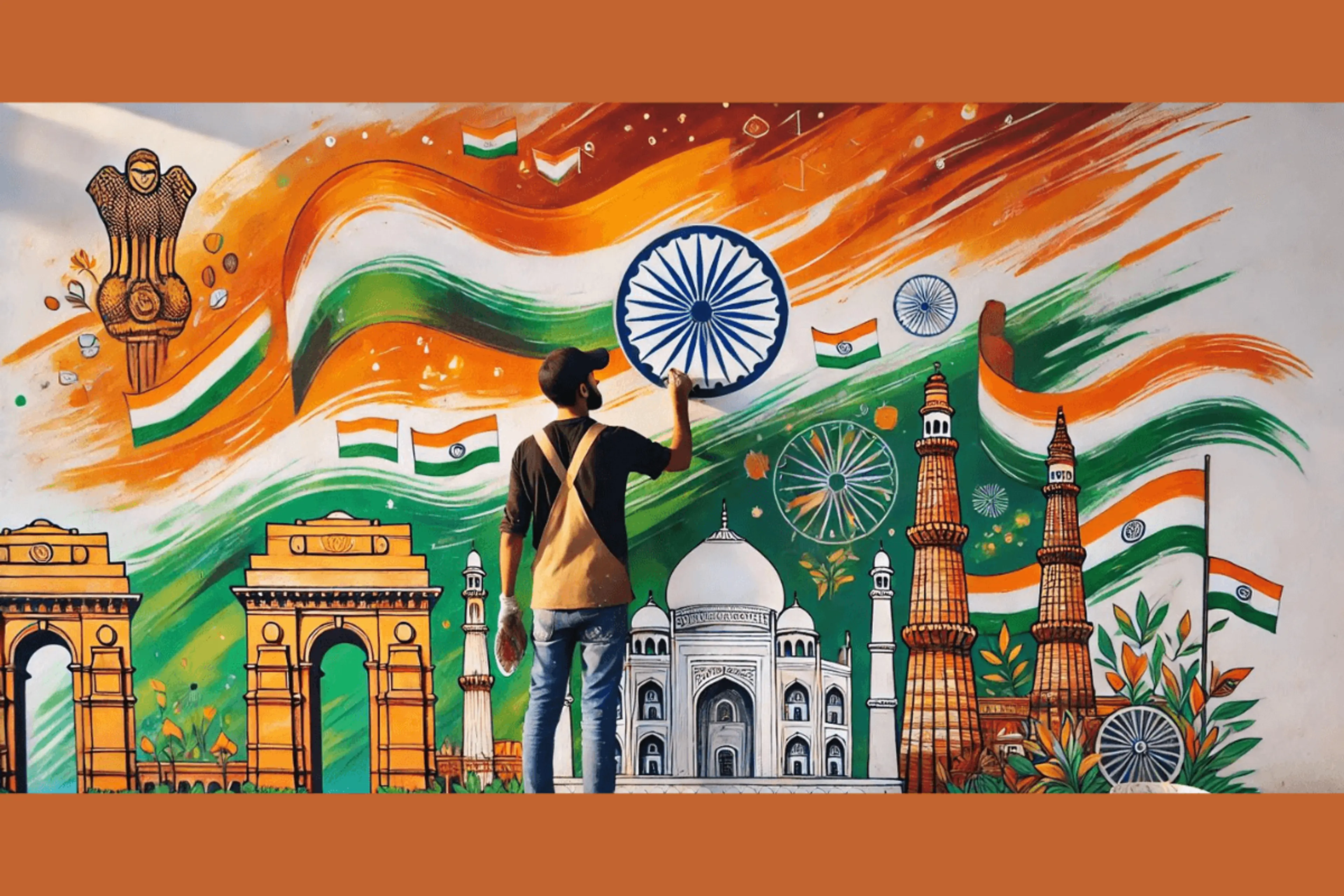
Started simple. Grabbed this huge, beautiful photo of a mountain range with a massive flag stuck on top. Thought, “Yeah, this screams impact!” Slapped it across a landing page banner for a community event website.
What the hell happened? Total disaster.
- It was TOO big. Like, overwhelming.
- The bright reds and blues made all the text I put over it completely unreadable.
- Looked like a government poster from the 80s.
Felt super frustrated. I just knew it was wrong the second I saw it. Pissed me off because I wasted like an hour finding the “perfect” image. Deleted the whole thing.
Second Attempt: Subtle Textures Actually Worked
Okay, scrapped the huge photo idea. Needed a different angle. Remembered seeing textured backgrounds somewhere. Thought maybe a piece of a patriotic image could be interesting.
Found a super close-up shot of the threads in a flag. Just the weave, no obvious stars or stripes right away. Took that.
- Desaturated it a lot, almost to grayscale.
- Set the layer blending mode in Photoshop to “Overlay” with super low opacity, maybe 15%.
- Put that texture underneath some clean typography and icons.
Wow. HUGE difference. The background had this subtle, almost fabric-like feel. It felt patriotic but super sophisticated. No screaming colors. No obvious symbols hitting you over the head. Just a quiet feeling. People looking at my test page actually commented they liked the background but couldn’t quite place it. That’s exactly what I wanted! Takeaway: Tiny bits of patriotism work way better than the whole fireworks show.
Third Shot: Small Accent Pieces FTW
Feeling better now. Decided to get bolder, but small. Didn’t want to ruin the vibe. For a fundraising campaign mockup, I needed icons.
- Used a tiny icon of a hand holding a small flag.
- Not the main icon, just one among several.
- Placed it near the “Support Local Heroes” headline.
- Kept it small, clean, monochrome at first.
Looked okay, safe. Then I thought, maybe just that icon could use a tiny pop of color? Changed only that one small flag icon to have a single stripe of red.
Boom! Suddenly it felt intentional. That little flash of red drew the eye straight to “Support Local Heroes” without being loud or cheesy. It felt positive and community-focused, not forced. Worked perfectly as an accent piece. Takeaway: You don’t need much. One tiny element, used smartly, punches way above its weight.
What Actually Stuck?
So after all that trial and error (mostly error at first!), here’s what I’ll actually use next time I need patriotic vibes:
- Forget the Epic Shot: Ditch the huge landscape-with-flag banner unless you want it to look like propaganda. Usually ends bad.
- Texture is Your Friend: Grabbing just a part of a flag photo, desaturating it heavily, lowering opacity, and using it as an Overlay texture underneath clean text is golden. Creates mood without being obvious.
- Accent for Impact: A single small icon element (like a tiny flag), used sparingly and maybe with just one bit of color strategically placed, gives the perfect subtle nudge. Makes it feel purposeful.
Phew. Glad I figured this out before my next client project needed a “patriotic touch.” Would have blown it!