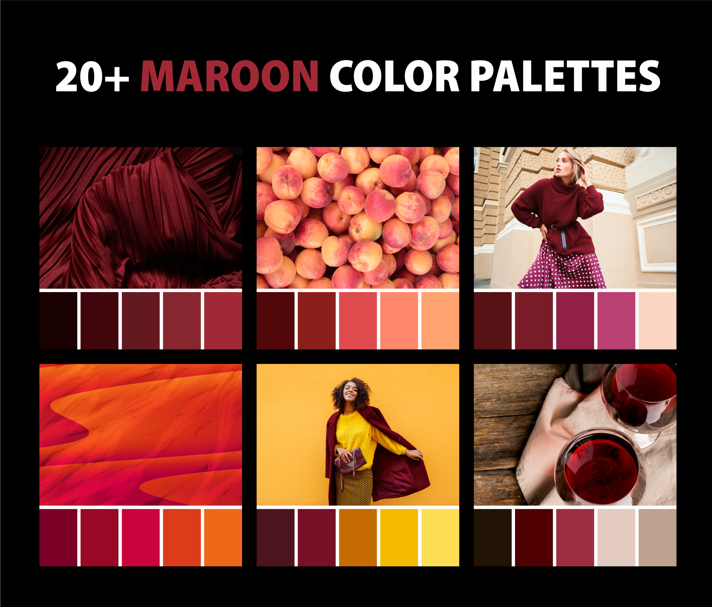
Alright, so I decided to figure out what colors actually look good with maroon. It’s one of those colors, you know? Rich, kinda deep, but then you’re stuck wondering how not to mess it up. My place needed a bit of a refresh, and I’d picked up this really nice maroon throw for the sofa. That’s where my whole experiment started.

My First Attempts and What I Noticed
So, I draped the maroon throw over the sofa. My sofa is a kind of light grey, and honestly, that looked pretty decent right off the bat. But I wanted more, you know? I started pulling out other stuff I had around the house. First, I tried some bright yellow cushions. Nope. Looked like a fast-food joint. Too much, too loud.
Then I went for black. I thought, “black goes with everything, right?” Well, with maroon, it felt a bit… heavy. Like, super serious and maybe a bit dated for the vibe I was going for. It wasn’t awful, but it wasn’t sparking joy, let’s put it that way.
Digging Deeper and Finding Some Winners
I started looking around, just observing color combos when I was out, or flipping through some home decor magazines I had lying around – not for serious research, just for ideas. I noticed maroon was often paired with softer, more muted tones. This got me thinking.
So, back to my living room. I grabbed a few things:
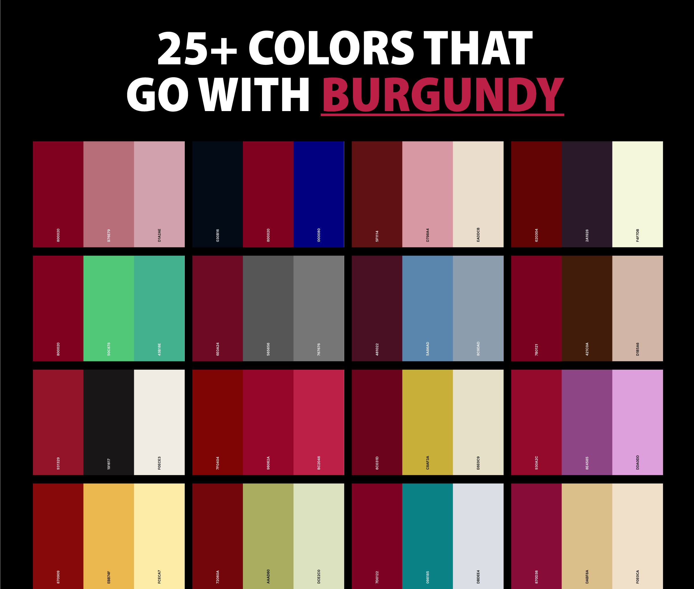
- Cream and Beige: I had some cream-colored cushion covers. Put those next to the maroon throw, and boom! Instantly softer, more inviting. The maroon still popped, but it felt more elegant. Beige worked in a similar way, very calming and neutral. This was a good start.
- Dusty Rose / Soft Pinks: I found an old dusty rose scarf. Draped it nearby. Wow. That was a surprise. It’s kind of in the same family as maroon, but way lighter. They looked really sophisticated together. Not like a super girly pink, but a more grown-up, muted one.
- Gold and Brass: I’ve got this old brass lamp. Moved it closer to the maroon. The warmth of the metallic really complemented the depth of the maroon. I reckon a muted gold, not too shiny, would be amazing too. Like for picture frames or little trinkets.
Getting a Bit Bolder
Okay, the safe bets were in. But I wanted to see if I could push it a bit. I started thinking about contrasts, but not crazy ones.

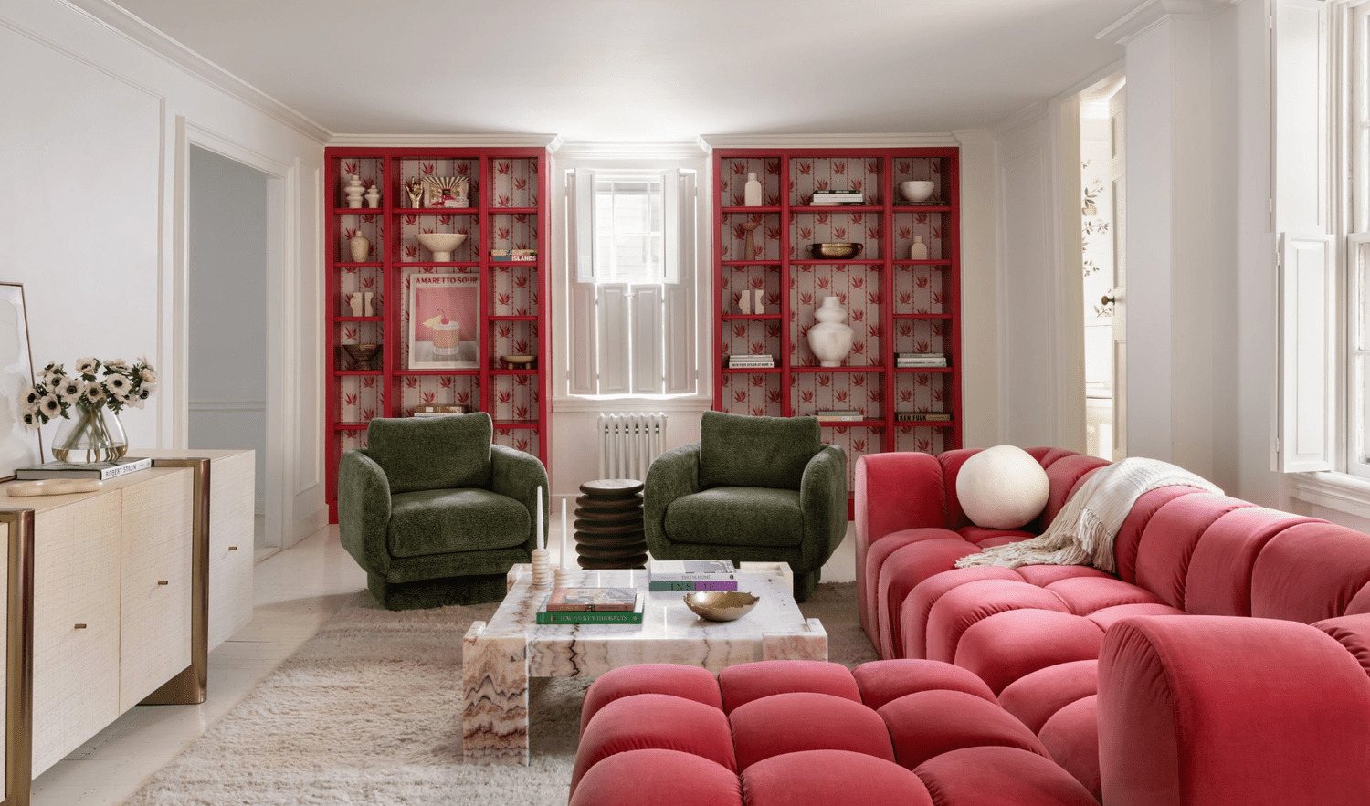
Olive Green / Forest Green: This was a leap of faith. I have a couple of plants with deep green leaves. I put one next to the sofa. And you know what? It worked! The earthy, deep green against the rich maroon felt very natural and grounded. I think a darker, more desaturated green is key here, not a bright, grassy green.
Navy Blue: I was a bit hesitant about this one, thinking it might be too dark like the black. But I tried a navy cushion I had. It was… okay. I think it depends on the shade of maroon and navy. If they’re both very dark, it can get a bit muddy. But a slightly brighter navy, or using it as a smaller accent, that could work. I felt it needed a third, lighter color, like cream, to break it up.
Charcoal Grey: My sofa is light grey, but I tried a darker charcoal grey texture with the maroon. That was nice. It’s a strong, modern look. Less harsh than black, but still gives that sense of depth and seriousness if that’s what you’re after.
What I Settled On (For Now)
So, after all that mucking about, I found that for my maroon throw, I really loved it with the cream cushions. It just felt right for my space. I also added a touch of that muted gold with a small tray on the coffee table. And my plant with the deep green leaves sits nearby, and the combo is just lovely.
It was a fun little process, just moving things around and seeing what clicked. Maroon isn’t so tricky after all, you just gotta play with it a bit and see what feels good to your own eye. Definitely learned that just because a color is bold doesn’t mean everything else has to be super quiet, or super loud either. It’s all about that balance, I guess.


