
Discovering Moda Operandi’s Brand Rules
Got this email about featuring Moda Operandi on my fashion blog. Thought I’d just slap their logo on my post header like always. Grabbed a jpg from Google Images, made it purple to match my site’s theme. Looked kinda cool to me.
My Epic Fail Moment
Posted it and immediately got roasted in the comments. Someone tagged Moda Operandi’s official account saying “This ain’t it fam.” Felt like an idiot when I saw their reply linking to their style guide. Turns out they’re mega strict about logo usage.
Digging Through the Style Guide
Spent three hours studying their PDF like it’s some ancient manuscript. The rules were crazy specific:
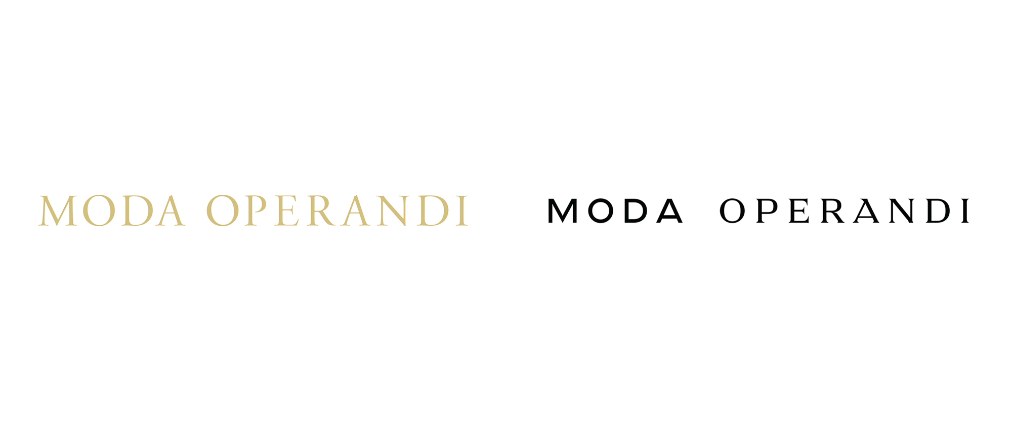
- Color: Only pure black or pure white allowed. No exceptions. My purple version? Straight up violation.
- Spacing: Must have empty space around logo equal to the height of the letter “M” in their logo. Measured mine – was way off.
- Backgrounds: Dark logos only on light backgrounds, light logos only on dark. Mine was medium grey. Fail.
The Fixing Process
First I hunted down their official press kit – took forever to find the download button hiding in tiny text. Got the proper SVG files. Redid my entire header background to pure white. Resized the logo painstakingly using Photoshop’s rulers to measure that “M” clearance. Felt like doing math homework but for fashion.
Live Testing
Uploaded the corrected version and held my breath. No angry comments this time. Actually got compliment from that same snarky commenter saying “props for fixing it properly.” Moda Operandi’s social team even liked the post. Learned my lesson – brands don’t play around with their logos. Don’t just grab and colorize like I’m doodling in kindergarten. Those style guides exist for good reasons.