My Little Project: Blue, White, and Yellow
Alright, so the other day, I got this itch to do a small project. I had these three colors in my head: blue, white, and yellow. Just those. I was looking at this plain, boring little shelf I’ve had for ages, and thought, “Yeah, let’s give this thing some life.” I pictured something bright, maybe a bit beachy, or just, you know, cheerful.
So, I dug out my paints. Got a nice sky blue, a sunny yellow, and a crisp white. My plan was pretty loose, to be honest. Just get the colors on there, see what happens. Maybe some stripes, maybe some blocks of color. Easy peasy, right?
The First Go – And the “Oh, Whoops” Moment
I jumped right in. Slapped some blue on one part of the shelf. Then, feeling all creative, I went to add a big splash of yellow right next to it. Here’s the kicker – the blue was still wet. Like, really wet. And bam! Before I knew it, where the blue and yellow met, I got this… well, this sludgy green. Not the vibrant, distinct colors I was going for. Man, it was a bit of a letdown. Looked kinda like baby food, if I’m being honest.
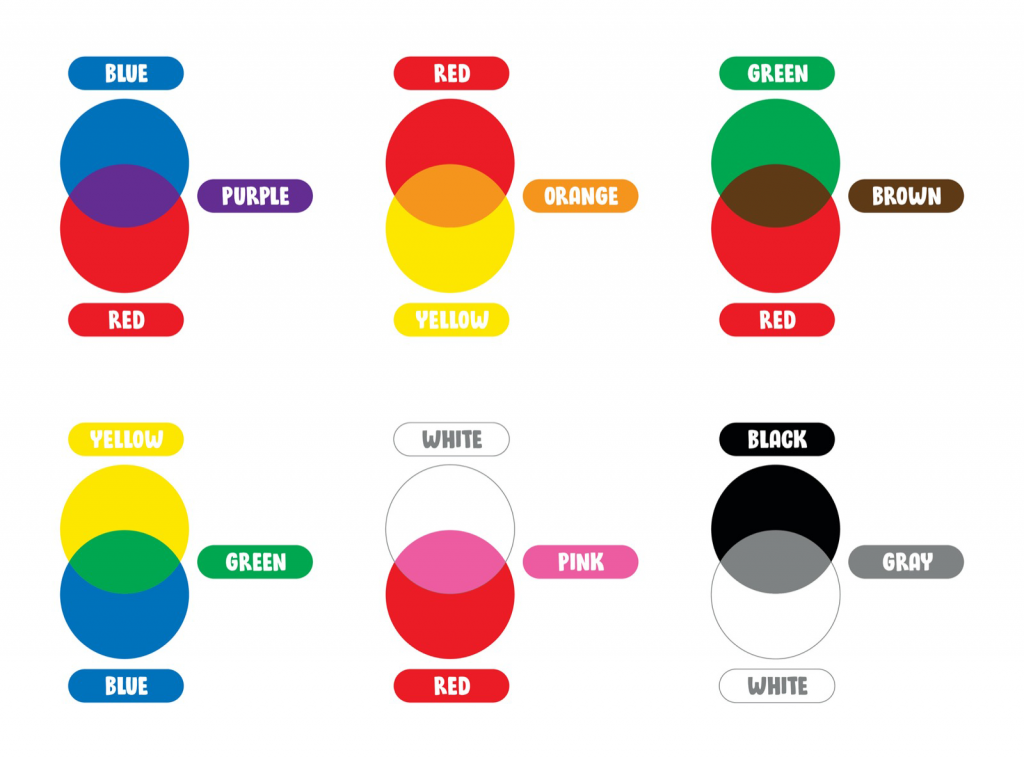
I just sort of stood there, brush in hand, thinking, “Well, that’s not it.” It’s funny, ’cause deep down, you know blue and yellow make green. It’s like rule number one in color mixing. But in the excitement of starting, I guess my brain just took a little vacation. I was so focused on getting the colors on there, I didn’t think about how they’d react.
Hitting the Reset Button (Mentally)
Okay, so I had to scrape off the wet, greenish mess. Waited for what was left to dry properly. And I actually stopped and thought for a minute. The key, I realized, was going to be patience. And separation. Those two colors, blue and yellow, they needed their own space, or at least they needed to be properly introduced without getting all mixed up immediately.
That’s where the white came in, not just as a third color, but as a strategy. I figured white could be a good buffer, or a way to keep things clean and distinct. I also remembered reading somewhere, or maybe seeing a video, that if you want colors like blue and yellow to sit next to each other without turning into green, you gotta let one dry completely before you even think about putting the other one near it. Or leave a clear gap!
Round Two: The Actual Plan in Action
So, with a bit more of a plan, I started over. Here’s how I tackled it this time:
- First, I painted sections with the blue. Just the blue. And then – this was the hard part for impatient me – I walked away. Let it dry completely. No touching, no “is it dry yet?” poking every five minutes.
- Once the blue was bone dry, I moved on to the yellow. I carefully painted yellow in other sections. Sometimes, I left a tiny, tiny unpainted line of wood between the blue and the yellow. Other times, I painted the yellow right up to the edge of the dry blue, super carefully.
- Then came the white. This was where it got interesting. In those little gaps I’d left, I filled them with white. It made a really clean, sharp border. Looked pretty neat.
- I also used white to lighten things up. Mixed a bit of white with the blue to get some softer, paler blue shades. Did the same with the yellow to get some buttery yellows. This gave the whole thing a bit more variety than just the straight-out-of-the-tube colors.
- And for a final touch, once everything was dry, I used a tiny brush to add some small white accents – like little dots or thin lines on top of the blue and yellow areas. Just to make it pop a little.
The End Result and What Stuck With Me
And you know what? It actually looked good! The shelf was transformed. The blue was bright and clear, the yellow was sunny, and the white just made everything look crisp and intentional. No more swampy green, thank goodness.
It sounds so simple when you say it out loud – let your paint dry, don’t mix colors you don’t want to mix. But actually doing it, and remembering to do it when you’re in the zone, that’s the thing. For me, the big takeaway was definitely about slowing down. And thinking about how colors work together, not just what they look like on their own. The white, especially, turned out to be more useful than I first thought, not just as a color, but as a helper to manage the other two. So yeah, a successful little makeover, and a good reminder of some painting basics!