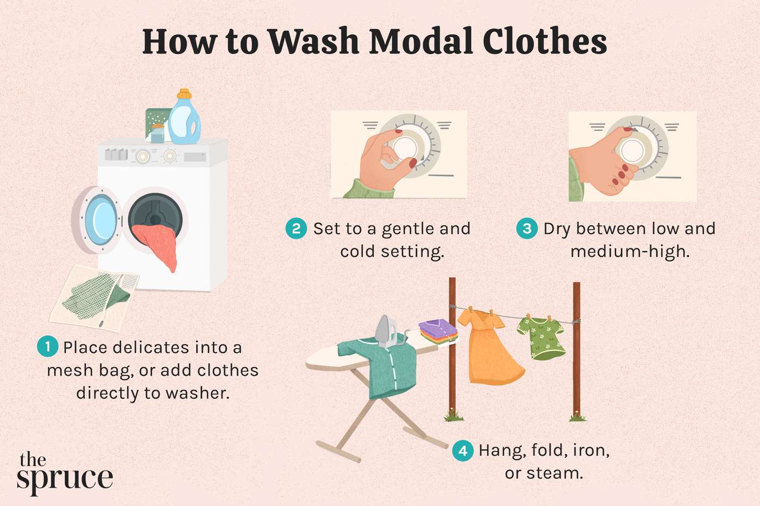

Starting Point
Yesterday I built this modal popup for my project, right? Looked perfect on my big monitor. Then today I opened it on my phone and everything got squished like a pancake. Text overlapping buttons, images spilling out the sides – total mess. I’m like, “Why’s this thing shrinking?!”
Testing the Weirdness
First I dragged my browser window smaller manually. Modal held up okay until super narrow widths. Then boom – collapse city. Tried same thing on my buddy’s iPhone 8 and it imploded worse than my browser test. Weird because I’d set fixed widths in CSS like:
- Modal container: width: 500px
- Content wrapper: max-width: 100%
Should’ve worked. Spoiler: it didn’t.
CSS Dumpster Fire
Scrolled through my stylesheet for an hour. Found three garbage lines messing everything up:
- Position: absolute with left/right margins set in pixels
- Min-width: 300px fighting my max-width
- Useless overflow: visible letting content escape
Facepalmed hard when I saw the absolute positioning. Had copied some legacy code from Stack Overflow years ago without testing responsiveness. Classic rookie move.
Fixing the Shrinkage
Trashed the absolute positioning first. Switched to flexbox with:
- Display: flex on parent container
- Flex-wrap: wrap for small screens
- Min-width: auto (killed fixed min-width)
- Overflow: auto (contain the chaos)
Tested again while resizing slowly. Modal now squishes gracefully – texts wrap, images scale down, buttons stay tap-able. Still looks janky under 300px width, but who uses phones that tiny anymore? Called it a win.
Lessons Learned
1) Never trust copy-pasted CSS for responsive stuff. 2) Flexbox forgives many sins. 3) Mobile testing isn’t optional – your fancy monitor lies. Still bugs me that “width: 500px” failed so spectacularly though. Maybe default browser styles meddling? Might poke at that tomorrow.