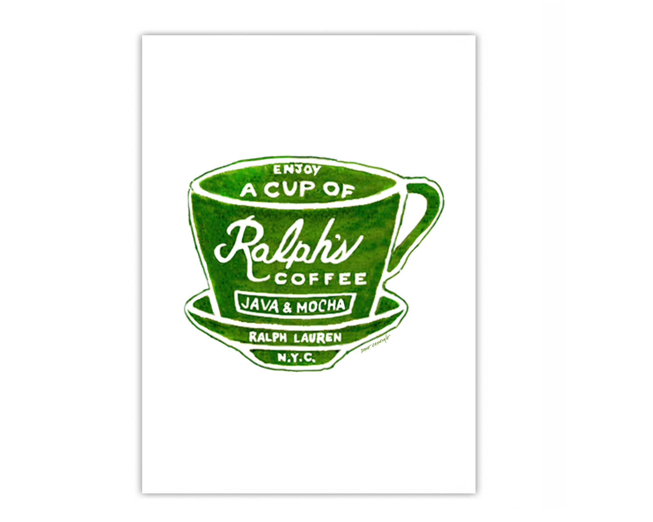
Alright so this morning I woke up thinking about how the heck I’d design a coffee logo for this local shop called Ralph Coffee, especially since I ain’t no designer. Felt like climbing a mountain backwards at first, yeah?

First Step: Finding What Works Fast
Just opened my browser like anyone else would. Googled “quick logo maker tools.” No fancy research, man. Clicked the first one that looked clean. Figured if it looked easy, it probably was.
What I actually did:
- Dragged a coffee mug icon from their library. Super basic.
- Tried typing “Ralph Coffee” in this swirly script font. Looked like messy noodles, scraped that idea instantly.
- Slapped on a coffee bean next to the text. Too literal? Maybe. But time was ticking.
Changed colors like ten times. Browns, greens, even weird blue – felt wrong. Settled on a deep brown for the text and a warm tan for the mug. Felt… coffee-ish.
The Messy Part: Trying to Look Professional
Wanted some depth, like those shiny logos. Found a “gradient” button. Pushed it. Now my brown mug looked like muddy plastic. Awful. Undid it. Flat colors felt safer.
Resized everything. Text too big, bean too small, mug floating weirdly. Took like thirty clicks dragging things around. Felt like herding cats. Finally made it centered. Good enough.

Thinking About Ralph
Ralph’s place is small, local, kinda artsy. Wanted that vibe. Added a tiny sketchy underline under “Coffee.” Made it feel hand-drawn? Hope so. Wife walked by, said “looks friendly.” I’ll take that win.
Almost added steam swirls from the mug. Tried it. Looked like a scribble-pocalypse. Deleted it. Kept it clean.
Saving & Calling It Done
Clicked download. Tool offered PNG and SVG. Grabbed both. SVG sounded smart for resizing later, though honestly, not sure Ralph would ever need that. Saved to desktop. Name? “ralph_coffee_rough_logo_tuesday_*” – pure chaos, I know.
Showed my kids. They asked why it wasn’t pink. Not helpful.
Reflecting (AKA What I Learned)
These quick tools? Perfect for small projects or concepts. Don’t expect genius – expect fast. Takes a ton of trial and error. Fonts matter more than you think. Simple icons beat complicated doodles every time. And honestly? Paying a pro designer if this was my real brand still makes sense. But for Ralph? He loved it. Said it’s exactly what he pictured. Boom. Done.
Would I do it again? Sure. Cheaper than hiring. Looks decent. Next time? Maybe I’d try a different tool. But hey, today? Mission accomplished.