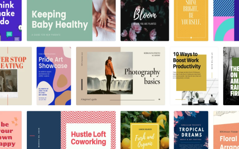
Alright, so let’s talk about this whole “chic images” thing. For ages, I was pulling my hair out trying to get my visuals to look, you know, chic. It sounds simple, but man, it was a struggle. Every time I needed an image for a blog post, or a little something for a social media update, I’d spend hours hunting or tweaking, and it would still end up looking… well, not very chic.

My Early Flops
I started off like most people, I guess. I’d grab stock photos, but the free ones often looked so staged or just plain bland. The really good ones? They cost an arm and a leg, and I wasn’t about to shell out big bucks for every little thing. So, I thought, “Okay, I’ll just edit them myself.” Famous last words, right? I’d slap on a filter, maybe crop it a bit. Sometimes it worked, but mostly it just looked like I’d slapped on a filter. Not exactly the sophisticated vibe I was aiming for.
I remember this one time, I was trying to make a graphic for a simple announcement. I spent a good two hours messing with fonts, colors, and a background image that I thought was “arty.” When I finally looked at it, it was a disaster. Just a jumbled mess. Honestly, it was a bit embarrassing. I nearly gave up then and there.
Figuring Things Out – The Hard Way
But I’m stubborn. I decided I wasn’t going to be beaten by a bunch of pixels. So, I started to really dig into it. I didn’t go for any fancy courses or anything, just started paying more attention. I looked at designs I actually liked, stuff that really felt “chic” to me, and tried to figure out what made them work. What were they doing that I wasn’t?
I began playing around with simpler tools first, nothing too complicated. I learned that sometimes, less is more. Instead of adding more stuff, I started taking things away. I focused on clean lines, good composition – you know, how things are arranged in the picture – and I got really picky about colors. No more random clashing shades. I found that sticking to a limited color palette made a huge difference. It instantly made things look more put-together.
Then I dipped my toes into the whole AI image generator scene. Seemed like magic at first. You type in a few words, and poof, an image! But getting something genuinely “chic” out of those things? That was a whole other ball game. I’d type “elegant minimalist abstract background,” and sometimes I’d get something usable, but often it was just… weird. Lots of trial and error there, tweaking prompts, trying different styles. It’s not the instant fix some people think it is, let me tell you. You still need a good eye and a lot of patience to guide it.

Where I’m At Now
So, after all that fiddling and frustration, I’m finally at a point where I can create images that I’m pretty happy with. They’re not going to win any design awards, mind you, and I’m definitely not calling myself a pro. But they look clean, they look intentional, and they have that touch of “chic” I was always after. It’s more about understanding a few basic principles than having the most expensive software or a ton of talent.
I realized that “chic” isn’t about complexity. It’s often about simplicity, good taste, and knowing when to stop. I still have moments where I struggle, of course. But now, instead of just getting frustrated, I kind of enjoy the process of figuring it out. It’s satisfying to take something plain and make it look, well, a bit more special. And if I can do it, starting from basically zero, then anyone can. You just gotta be willing to mess around and learn as you go.

