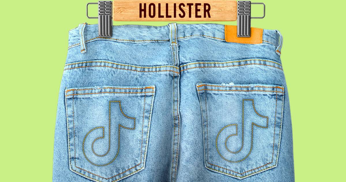
Okay, so I wanted to share my little adventure with the Hollister rebrand concept. Buckle up, it’s a wild ride!

It all started when I was just zoning out, scrolling through Instagram. I noticed Hollister’s feed was kinda… blah. It felt outdated, like they were still stuck in the early 2000s with those super-dark stores and overly-enthusiastic lifeguards. I thought, “Man, they could really use a refresh.” So, me being me, I decided to take matters into my own hands – unofficially, of course.
First thing I did was dive deep into their target audience. I mean, who are they even trying to reach these days? I spent a good chunk of time lurking on Gen Z forums, TikTok, and even their competitors’ pages. What I gathered was that Gen Z values authenticity, inclusivity, and sustainability. They’re not buying the fake, picture-perfect lifestyle anymore. They want realness.
Next, I started brainstorming. I literally grabbed a bunch of sticky notes and just scribbled down every single word and idea that came to mind: “California,” “beach,” “relaxed,” “comfortable,” “inclusive,” “eco-friendly.” Then, I started grouping them and trying to find a common thread. I wanted to keep the essence of Hollister – that laid-back California vibe – but make it relevant for today’s generation.
Then came the fun part: the visuals. I started mocking up a new logo, something cleaner and more modern. I played around with different fonts and color palettes. I moved away from the dark, moody blues and went for brighter, more optimistic colors – think sunset oranges, sandy beiges, and ocean blues. I wanted it to feel fresh and inviting.
After logo, I moved on to the marketing materials. I thought about the type of imagery they should use. No more overly-posed models! Instead, I envisioned real people, diverse backgrounds, laughing and having fun on the beach. And I thought about how they could push towards using recycled materials, partnering with sustainable brands, and even showcasing content from real customers.

Here’s a breakdown of what I did:
- Logo: Modernized the font, brighter colors.
- Imagery: Real people, diverse backgrounds, candid shots.
- Social Media: Focus on user-generated content, authentic stories, and behind-the-scenes glimpses.
- Sustainability: Emphasize eco-friendly practices and partnerships.
- Inclusivity: Showcase a wider range of body types, ethnicities, and identities.
I even put together a mini-presentation with mood boards and mockups. It wasn’t anything fancy, just something to visualize my ideas. I felt like I was on fire. The rebrand was brewing, and the output was really good.
Now, what I did with this “rebrand” is nothing. It was a personal project, a creative exercise. Did it actually change anything at Hollister? Nah, probably not. But it was a blast, and it definitely got my creative juices flowing. Plus, it reminded me that sometimes, the best projects are the ones you do just for fun.
