
Alright, let’s talk about figuring out colors that actually work with dark green. I went through this myself not too long ago when I decided to paint a small wall in my study this really deep, forest green color. Sounded great in my head, you know? Moody, sophisticated. But once the paint was up, I stood back and thought, “Okay, now what?” It suddenly felt like a very bossy color, and I wasn’t sure what could stand next to it without clashing or just looking dull.
So, the first thing I did was just live with the green wall for a day or two. Let my eyes adjust. Then, I started pulling stuff I already owned into the room. Didn’t buy anything new yet, just experimented. I grabbed cushions, throws, picture frames, even some books with different colored covers.
My Little Experiments
Here’s kinda how it went down, piece by piece:
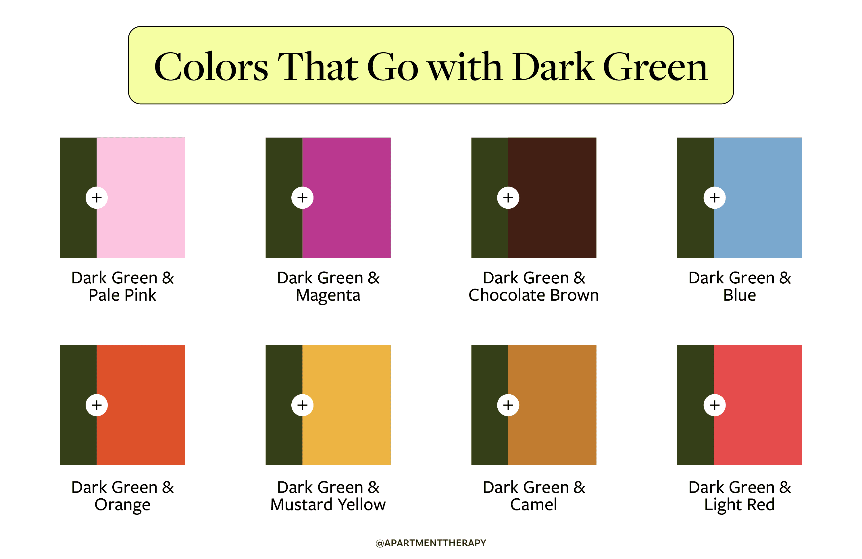
- Whites & Creams: Okay, obvious first step. Pure white looked clean, sure, but a bit too stark for me. Felt like a hospital waiting room next to that rich green. But then I tried an off-white, more like a creamy white or a light beige. That was way better. It softened the whole look, made the green feel warm rather than just dark. Big thumbs up for warm neutrals.
- Wood Tones: I have this old oak bookshelf. Dragged it over (well, slid it carefully) next to the green wall. Perfect match. Seriously, natural wood tones – light oak, walnut, whatever – they just look right with dark green. Very earthy, very grounded. Felt instantly calmer.
- Metallics: This was interesting. I had a silver photo frame and a brass lamp. The silver/chrome felt… cold. Didn’t quite mesh, to my eye anyway. But the brass and gold? Oh yeah. Looked really elegant. Made the green feel luxurious. Even aged bronze or copper worked well, giving it a more rustic vibe.
- Pinks & Peaches: Sounds weird, maybe? But I tried a dusty rose cushion I had. Surprisingly lovely! It wasn’t overly sweet, just a soft, muted contrast. A pale peach or even a light terracotta color also worked wonders, adding warmth without being loud. Didn’t go for bright pink, though – that felt like it would fight the green.
- Yellows & Oranges: Mustard yellow was a winner. It’s warm, a bit retro, and just pops beautifully against the dark green without being jarring. Burnt orange also looked good, very autumnal and cozy. Again, kept it muted – no lemon yellow or traffic cone orange.
- Other Colors: Tried some blues. Navy felt too dark alongside the green, kinda muddy. Lighter blues were okay, but didn’t give me the same warm feeling I was after. Purple? A deep plum could work for a very dramatic look, but wasn’t quite right for my little study space.
What I Ended Up With
So, after all that messing around, what did I actually choose for my study?
I stuck heavily with the creamy off-white for the adjacent walls and the trim. It just brightens things up enough without losing the cozy feel.
Lots of natural wood stayed – the bookshelf, a small wooden desk. It feels essential with the green.
For accents, I leaned into brass. The lamp, some drawer handles, a picture frame. It just lifts the whole thing.
And then, for fabric, I used a cushion with a subtle mustard yellow pattern and another plain one in that dusty rose/pink color. Plus, lots of actual green plants in terracotta pots – you can’t go wrong with more green, right?
Honestly, the key for me was just trying things out in the actual space. Seeing the colors next to each other in the real light. Dark green felt intimidating at first, but it plays really well with warm neutrals, wood tones, metallics like gold/brass, and those softer, muted accent colors like dusty pink and mustard yellow. Turned out much cozier than I expected.