
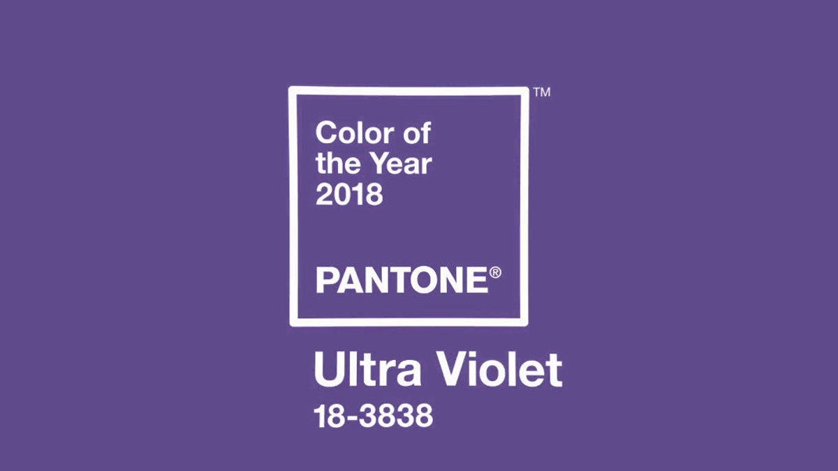
Okay, so I remember when Pantone announced Ultra Violet as the Color of the Year back for 2018. Heard the buzz online, saw some articles popping up. My first reaction was something like, “Huh, purple. That’s… bold.” It definitely caught my attention, seemed quite deep and maybe a bit spiritual or something.
Getting Curious
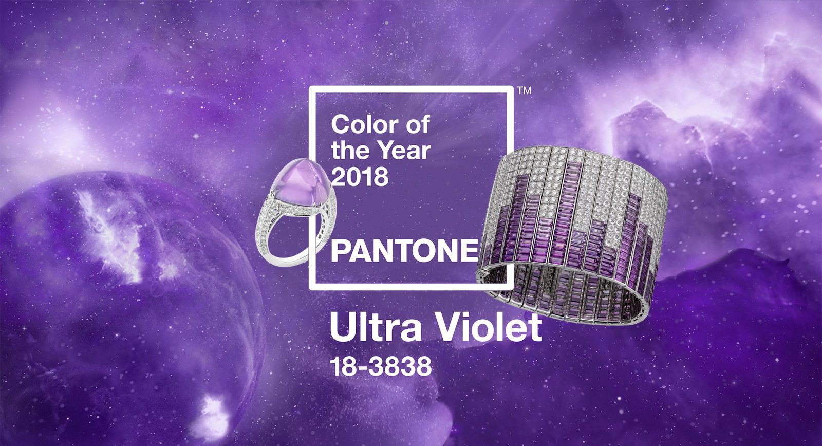
I couldn’t just leave it at that. Started looking it up more intentionally. Just typed it into search engines, saw the official Pantone swatch and lots of examples. Fashion runways, graphic design, even some home decor ideas. It looked pretty intense on screen, a really vibrant, blue-based purple. Made me think, how would I actually use a color like that in real life? It felt a bit dramatic for my usual style.
Trying It Out – Small Steps
Painting a whole room? No way, too much commitment for me with such a strong color. I decided to dip my toes in first. My approach is usually to start small with trends like this.
- First, I went through my closet. Didn’t find much purple, definitely nothing close to this specific shade. Okay, so wardrobe wasn’t the easy route.
- Then I thought about my living space. Much easier to add small touches there.
- I started browsing online shops, specifically looking for home accessories in Ultra Violet or something very close.
- Found some nice-looking velvet throw pillow covers. Seemed like a safe bet. Ordered two.
- While waiting for those, I actually stumbled upon a small glass candle holder in a local shop. It wasn’t exact, but it had that deep violet vibe. Bought it.
Putting It in Place
When the pillow covers arrived, I immediately swapped them onto the pillows on my grey sofa. Wow. They definitely stood out. Like, a lot. It was a real pop of color, maybe even more than I expected. I lived with them for a few days, trying to get used to the look.
The candle holder found a spot on my bookshelf. Placed it next to some books and a little green plant. That felt… better. More subtle. It caught the light nicely.
Thoughts on the Experiment
So, what did I think? The Ultra Violet was powerful, no doubt. The pillows, while good quality, felt a little overwhelming in my fairly neutral living room. They really drew the eye, maybe too much. It wasn’t quite relaxing to me, felt more energetic.
The small candle holder, though? That worked. It was just a tiny accent, a hint of that interesting color without dominating the space. I realized that for me, Ultra Violet worked best as a supporting player, not the main star. It needed balance.
Overall, it was a fun experiment. Pushed me to play with a color I wouldn’t normally choose. I kept the candle holder around for quite a while. The pillows? They had their moment, but I eventually swapped them back out for something calmer. It was a good hands-on way to understand how a trendy color translates into a real, everyday space. You don’t really know until you try it yourself, right?